Color is the silent storyteller of design; it communicates before words are read, evokes emotions before features are understood, and creates lasting impressions before products are experienced. The right color combinations can transform an ordinary design into an extraordinary brand experience that resonates deeply with your audience.
At Web Guider Agency, your trusted web design and development agency, we’ve spent over 5 years helping creative entrepreneurs, coaches, and businesses discover color palettes that don’t just look beautiful they convert visitors into customers. Through hundreds of projects, we’ve witnessed firsthand how strategic design color ideas can increase brand recognition by up to 80% and improve user engagement by over 40%.
Choosing the perfect color palette isn’t about following trends blindly or picking colors that simply “look nice together.” It’s about understanding color relationships, psychological triggers, and strategic application that aligns with your brand identity and business goals. Whether you’re launching a new brand, redesigning your website, or creating marketing materials, the colors you choose will fundamentally shape how your audience perceives and interacts with your business.
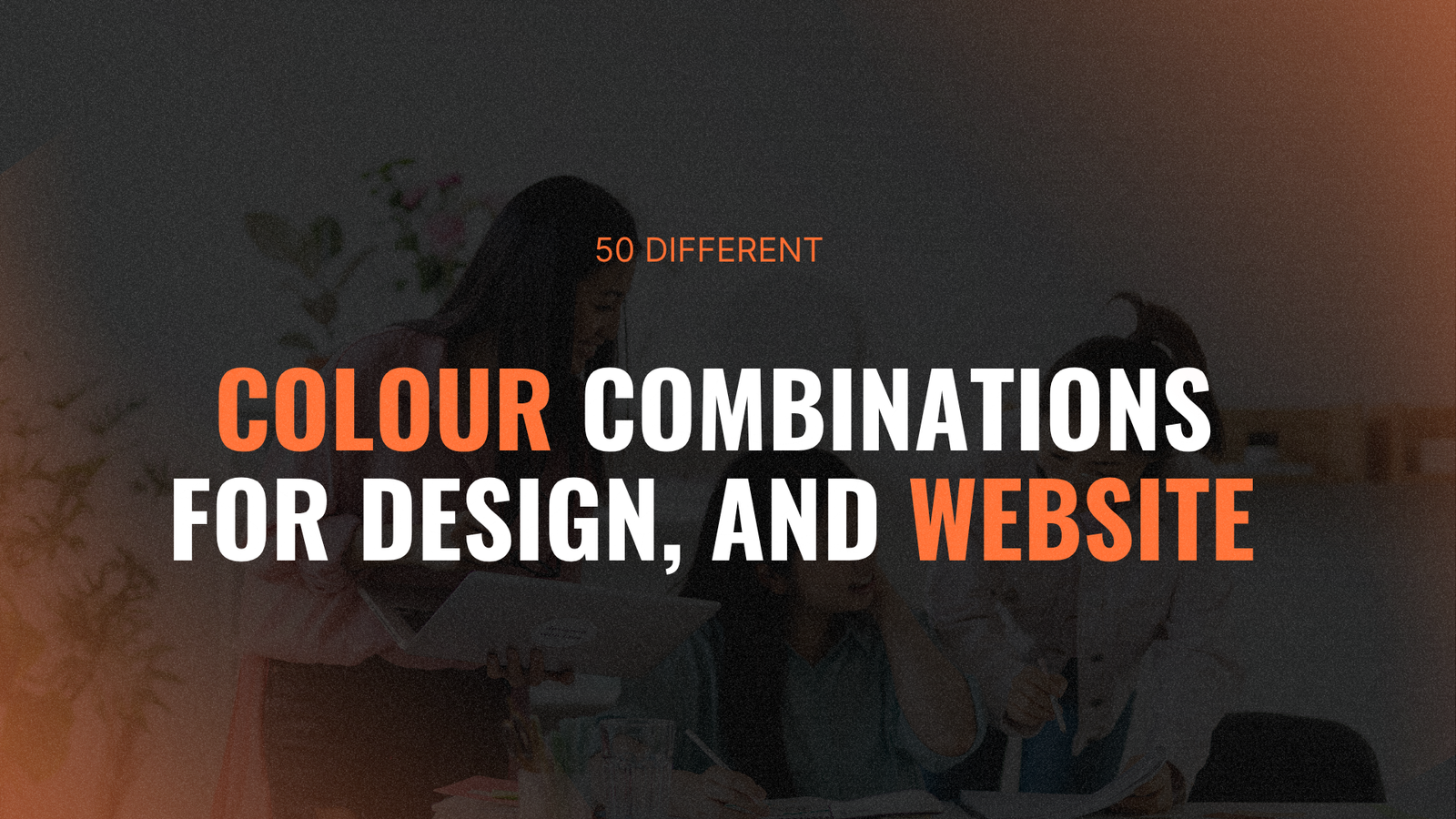
In this comprehensive guide, we’ll explore 50 powerful and unique creative palettes that span every mood, industry, and design style. You’ll learn foundational color theory principles, discover how to apply psychology to your color choices, and gain practical strategies for creating harmonious combinations that elevate your brand. From energetic and playful to sophisticated and calming, these carefully curated palettes will inspire your next creative project and help you make confident, strategic color decisions.
Understanding Color Theory Fundamentals
Before diving into specific color combinations, let’s establish a foundation in color theory the science and art behind how colors interact and influence perception.

The Color Wheel Explained
The color wheel is your most valuable tool for creating harmonious design color ideas. Developed by Sir Isaac Newton in 1666, it organizes colors based on their relationships and provides a visual guide for creating balanced palettes.
Primary Colors: Red, blue, and yellow are the foundation they cannot be created by mixing other colors but combine to create all other hues.
Secondary Colors: Green, orange, and purple are formed by mixing equal amounts of two primary colors.
Tertiary Colors: Red-orange, yellow-orange, yellow-green, blue-green, blue-purple, and red-purple are created by mixing primary and secondary colors.
Understanding these relationships allows you to predict which colors will harmonize naturally and which will create intentional contrast.
Color Properties That Shape Perception
Beyond just hue (the color itself), several properties affect how we perceive and respond to colors:
Value (Lightness/Darkness): Adding white creates tints (lighter versions), while adding black creates shades (darker versions). Value creates depth and hierarchy in your designs.
Saturation (Intensity): Highly saturated colors are vivid and attention-grabbing, while desaturated colors are muted and sophisticated. Adjusting saturation dramatically changes a color’s emotional impact.
Temperature: Warm colors (reds, oranges, yellows) advance toward viewers and energize, while cool colors (blues, greens, purples) recede and calm. Temperature creates spatial relationships in designs.
Tone: Adding gray to a color creates tones sophisticated, complex variations that feel more natural and easier on the eyes than pure hues.
These properties give you infinite variations within any single color, allowing you to create nuanced palettes that communicate precisely the right message.
Types of Color Harmony
Color harmony refers to arrangements that are pleasing to the eye. Here are the primary harmony types:
Monochromatic: Variations of a single hue using different values and saturations. Creates cohesive, elegant designs but risks feeling flat without careful value contrast.
Analogous: 3-5 colors adjacent on the wheel. Naturally harmonious and serene, perfect for creative palettes that feel organic and unified.
Complementary: Colors opposite on the wheel. High contrast creates vibrant energy but can overwhelm if both are highly saturated.
Split-Complementary: A base color plus the two colors adjacent to its complement. Offers contrast with more nuance than pure complementary schemes.
Triadic: Three colors evenly spaced around the wheel. Creates vibrant, balanced palettes with visual interest.
Tetradic: Four colors forming a rectangle on the wheel two complementary pairs. Complex but offers rich possibilities when one color dominates.
At our creative web agency, we use these harmony principles to create sophisticated palettes that balance visual interest with cohesion.
The Psychology Behind Color Combinations
Understanding how colors influence emotions and behavior is crucial for strategic design. Here’s how different colors psychologically impact viewers:

Warm Colors and Their Effects
Red: Increases heart rate and creates urgency. Communicates passion, excitement, and confidence. Perfect for calls-to-action but can feel aggressive if overused. Red can increase appetite, making it popular in food branding.
Orange: Energetic and friendly without red’s intensity. Conveys enthusiasm, creativity, and affordability. Orange promotes social interaction and is often used by youth-oriented brands.
Yellow: The most visible color, naturally draws attention. Evokes optimism, happiness, and clarity. However, pure yellow can cause eye strain and anxiety in large amounts use strategically for highlights.
Pink: Ranges from playful (hot pink) to sophisticated (dusty rose). Generally communicates femininity, romance, and compassion, though modern pink palettes challenge these associations.
Cool Colors and Their Impact
Blue: Decreases heart rate and promotes calmness. The most universally appreciated color, blue communicates trust, stability, and professionalism. Dominates corporate branding but can feel cold without warm accents.
Green: Easiest color for eyes to process. Represents nature, growth, and balance. Associated with health, wealth, and environmental consciousness. Green creates harmony and reduces stress.
Purple: Historically royal and luxurious. Stimulates creativity and imagination. Blue-purples feel calming and spiritual, while red-purples feel more energetic and luxurious.
Teal/Turquoise: Combines blue’s trustworthiness with green’s balance. Feels fresh, sophisticated, and contemporary. Popular in health, wellness, and tech industries.
Neutral Colors and Their Versatility
Black: Sophistication, luxury, power, and formality. Creates drama and makes other colors pop but can feel heavy or oppressive without balance.
White: Purity, simplicity, cleanliness, and space. Essential for creating breathing room in designs. Too much can feel sterile or empty.
Gray: Professional, timeless, and neutral. Warm grays (with red/yellow undertones) feel inviting, while cool grays (with blue undertones) feel more modern and tech-forward.
Brown: Earthy, reliable, and wholesome. Creates warmth and stability. Often associated with organic, handcrafted, or traditional brands.
Beige/Tan: Comfortable, accessible, and calming. Provides neutral foundation without the starkness of white or gray.
When we develop strategies at our professional website design agency, we always consider these psychological associations to ensure colors support rather than contradict brand messaging.
50 Powerful Color Combinations for Every Project
Now, let’s explore 50 carefully curated color combinations organized by mood and application. Each palette includes strategic guidance for implementation.
Energetic & Dynamic Palettes (1-10)

1. Citrus Burst
- Electric Orange (#FF6B35) + Sunshine Yellow (#F7931E) + Lime Green (#C1D82F) + Deep Charcoal (#36454F)
- Why it works: Vibrant warm colors energize while charcoal grounds the palette
- Best for: Fitness brands, youth marketing, summer campaigns, food delivery apps
- Implementation: Use charcoal for 60% (backgrounds, text), distribute bright colors as 30% secondary and 10% accents
2. Neon Nights
- Hot Pink (#FF10F0) + Electric Blue (#00F5FF) + Neon Purple (#BF0FFF) + Deep Navy (#1A1A2E)
- Why it works: High-contrast neons pop against dark navy creating nightclub energy
- Best for: Entertainment, nightlife, music apps, creative portfolios
- Implementation: Navy dominates backgrounds, neons highlight interactive elements and CTAs
3. Tropical Energy
- Coral (#FF6F61) + Turquoise (#06B6D4) + Mango (#FF9F1C) + Palm Green (#2F9E44)
- Why it works: Complementary coral and turquoise create vibrant balance, tropical associations
- Best for: Travel agencies, beach resorts, tropical products, vacation rentals
- Implementation: Turquoise backgrounds, coral for buttons, mango and green as accents
4. Retro Arcade
- Cyan (#00FFFF) + Magenta (#FF00FF) + Yellow (#FFFF00) + Black (#000000)
- Why it works: CMYK primary colors create high-impact, nostalgic gaming aesthetic
- Best for: Gaming brands, retro designs, tech startups, pop culture references
- Implementation: Black base with bright colors for UI elements and graphics
5. Sunset Gradient
- Peach (#FFB4A2) + Coral Pink (#E5989B) + Mauve (#B5838D) + Deep Plum (#6D6875)
- Why it works: Smooth color transition creates romantic, Instagram-worthy aesthetic
- Best for: Lifestyle brands, photography, beauty products, social media graphics
- Implementation: Use as gradient background or distribute across design elements
6. Sports Energy
- Vibrant Red (#DC2626) + Royal Blue (#1E40AF) + Bright White (#FFFFFF) + Charcoal (#374151)
- Why it works: Classic sports color combination creates confidence and competition
- Best for: Athletic brands, sports teams, fitness apps, competitive products
- Implementation: Balance warm red and cool blue with neutral white/charcoal buffer
7. Festival Vibes
- Fuchsia (#E91E63) + Sunny Orange (#FF9800) + Lime (#CDDC39) + Deep Purple (#6A1B9A)
- Why it works: Unexpected combinations create playful, celebratory energy
- Best for: Event marketing, festival branding, party planning, creative agencies
- Implementation: Use one color dominantly, others as playful accents
8. Urban Graffiti
- Spray Paint Red (#E63946) + Street Blue (#457B9D) + Concrete Gray (#A8DADC) + Black (#1D3557)
- Why it works: Street art-inspired palette feels authentic and edgy
- Best for: Urban fashion, street brands, hip-hop culture, youth movements
- Implementation: Gray and black foundation with bright color bursts
9. Spice Market
- Turmeric (#F4A261) + Paprika (#E76F51) + Cardamom (#2A9D8F) + Clove (#264653)
- Why it works: Warm spice colors with cool accent creates exotic, appetizing feel
- Best for: Restaurants, food blogs, spice brands, culinary products
- Implementation: Warm colors dominate, cool cardamom provides contrast
10. Electric Dreams
- Neon Green (#39FF14) + Hot Pink (#FF69B4) + Cyber Yellow (#FFD300) + Digital Black (#0A0A0A)
- Why it works: High-saturation colors against black create futuristic, digital aesthetic
- Best for: Tech products, digital art, gaming, futuristic brands
- Implementation: Black backgrounds make neon colors pop without overwhelming
Professional & Trustworthy Palettes (11-20)
11. Corporate Modern
- Navy Blue (#1E3A8A) + Sky Blue (#3B82F6) + Soft Gray (#E5E7EB) + Crisp White (#FFFFFF)
- Why it works: Traditional corporate colors with modern, lighter interpretation
- Best for: Financial services, consulting firms, B2B companies, professional services
- Implementation: Navy 40%, sky blue 30%, gray/white 30% for clean, trustworthy look
This palette dominates our web design services for corporate clients requiring credibility with contemporary appeal.
12. Healthcare Trust
- Medical Teal (#0D9488) + Sky Blue (#BAE6FD) + Clean White (#FFFFFF) + Soft Gray (#F3F4F6)
- Why it works: Teal and blue create calming, hygienic, trustworthy atmosphere
- Best for: Healthcare providers, medical apps, wellness brands, dental practices
- Implementation: White dominates for cleanliness, teal/blue for trust indicators
13. Financial Authority
- Deep Green (#065F46) + Gold (#F59E0B) + Charcoal (#1F2937) + Cream (#FFFBEB)
- Why it works: Green represents prosperity, gold adds prestige, creating wealth associations
- Best for: Banks, investment firms, financial advisors, wealth management
- Implementation: Charcoal base, green for primary elements, gold for premium accents
14. Tech Innovation
- Cobalt Blue (#0047AB) + Cyan (#06B6D4) + Silver (#94A3B8) + Deep Slate (#0F172A)
- Why it works: Blue spectrum creates tech credibility, cyan adds innovation energy
- Best for: Software companies, tech startups, SaaS products, IT services
- Implementation: Slate backgrounds, cobalt primary, cyan for interactive elements
15. Legal Gravitas
- Burgundy (#881337) + Navy (#1E3A8A) + Gold (#D97706) + Cream (#FEF3C7)
- Why it works: Traditional colors convey established authority and prestige
- Best for: Law firms, government, formal institutions, traditional businesses
- Implementation: Navy/burgundy dominance with gold as distinguished accent
16. Educational Excellence
- Scholarly Blue (#1E40AF) + Knowledge Green (#059669) + Parchment (#FEF3C7) + Deep Gray (#374151)
- Why it works: Blue and green create focused, growth-oriented learning environment
- Best for: Schools, e-learning platforms, educational content, academic institutions
- Implementation: Balanced blue/green with cream for readability, gray for structure
17. Architecture Professional
- Concrete (#6B7280) + White (#FFFFFF) + Black (#000000) + Accent Orange (#F97316)
- Why it works: Neutral base reflects materials, orange adds creative spark
- Best for: Architecture firms, design studios, construction, real estate
- Implementation: Mostly neutrals with strategic orange highlights for creativity
18. Insurance Security
- Forest Green (#14532D) + Ocean Blue (#0C4A6E) + Slate (#475569) + Off-White (#F9FAFB)
- Why it works: Deep, stable colors communicate security and reliability
- Best for: Insurance companies, security services, protective products
- Implementation: Dark colors create security feeling, off-white provides clarity
19. Accounting Precision
- Emerald (#047857) + Charcoal (#1F2937) + Soft Green (#A7F3D0) + White (#FFFFFF)
- Why it works: Green (money) with neutral precision colors creates financial expertise
- Best for: Accounting firms, bookkeeping, tax services, financial consulting
- Implementation: Charcoal dominance with green highlighting financial elements
20. Engineering Excellence
- Industrial Blue (#1E3A8A) + Steel Gray (#64748B) + Safety Orange (#F97316) + White (#FFFFFF)
- Why it works: Industrial colors with safety orange creates technical competence
- Best for: Engineering firms, manufacturing, industrial services, technical products
- Implementation: Blue/gray foundation with orange safety/action indicators
Calm & Minimalist Palettes (21-30)

21. Scandinavian Simplicity
- Soft White (#F9FAFB) + Light Gray (#E5E7EB) + Pale Blue (#DBEAFE) + Charcoal (#374151)
- Why it works: Light, airy colors create spacious, peaceful Scandinavian aesthetic
- Best for: Interior design, minimalist brands, lifestyle products, Nordic aesthetics
- Implementation: White dominates, gray structures, blue adds subtle warmth
22. Zen Garden
- Sage (#84CC16) + Stone Gray (#78716C) + Sand (#FDE68A) + White (#FFFFFF)
- Why it works: Natural, muted tones create meditation-ready tranquility
- Best for: Yoga studios, meditation apps, wellness retreats, spa services
- Implementation: Soft greens and grays dominate, sand adds warmth
23. Coastal Calm
- Seafoam (#A7F3D0) + Sand (#FEF3C7) + Driftwood (#78716C) + Ocean (#0891B2)
- Why it works: Beach-inspired colors create relaxing, vacation-like atmosphere
- Best for: Beach resorts, coastal brands, summer products, travel companies
- Implementation: Light seafoam/sand base with ocean and wood accents
24. Morning Mist
- Fog Gray (#E5E7EB) + Pale Rose (#FBCFE8) + Cloud White (#F3F4F6) + Soft Charcoal (#6B7280)
- Why it works: Extremely soft palette creates dreamy, gentle environment
- Best for: Baby products, gentle beauty brands, wellness apps, soft branding
- Implementation: Ultra-light colors dominate with charcoal for necessary contrast
25. Monochrome Elegance
- Pure Black (#000000) + Dark Gray (#374151) + Medium Gray (#9CA3AF) + Light Gray (#F3F4F6)
- Why it works: Timeless grayscale creates sophisticated, versatile foundation
- Best for: Luxury fashion, photography, premium products, minimalist design
- Implementation: Black for impact, grays for hierarchy, maximum flexibility
26. Natural Minimalism
- Linen (#FEF3C7) + Clay (#DC2626) + Sage (#86EFAC) + Charcoal (#1F2937)
- Why it works: Organic neutrals with subtle color create grounded sophistication
- Best for: Organic products, sustainable brands, artisan goods, craft businesses
- Implementation: Linen base, clay/sage strategic accents, charcoal for definition
27. Nordic Winter
- Ice Blue (#DBEAFE) + Snow White (#F9FAFB) + Frost Gray (#E5E7EB) + Midnight (#1E3A8A)
- Why it works: Cool, crystalline colors create pure, refreshing aesthetic
- Best for: Winter campaigns, Scandinavian brands, clean tech, minimalist products
- Implementation: Light blue/white dominance with midnight strategic depth
28. Desert Minimalism
- Sand (#FDE68A) + Terracotta (#DC2626) + Sage (#86EFAC) + Warm Gray (#78716C)
- Why it works: Southwestern earth tones create warm, grounded minimalism
- Best for: Southwestern brands, desert tourism, earthy products, bohemian style
- Implementation: Sand foundation with terracotta/sage natural accents
29. Japanese Aesthetic
- Rice Paper (#FFFBEB) + Cherry Blossom (#FCA5A5) + Bamboo (#86EFAC) + Charcoal (#1F2937)
- Why it works: Traditional Japanese colors create serene, cultural aesthetic
- Best for: Asian restaurants, cultural products, zen brands, minimalist design
- Implementation: Rice paper base, subtle cherry/bamboo accents, charcoal definition
30. Cloud Nine
- Sky Blue (#BFDBFE) + Cotton White (#FFFFFF) + Soft Gray (#E5E7EB) + Powder Blue (#DBEAFE)
- Why it works: Airy blues and whites create floating, ethereal feeling
- Best for: Cloud services, tech products, dreamy brands, sky-themed products
- Implementation: Extremely light with barely-there color variations
Warm & Inviting Palettes (31-40)
31. Autumn Harvest
- Pumpkin (#EA580C) + Burgundy (#881337) + Gold (#F59E0B) + Wheat (#FDE68A)
- Why it works: Fall colors create cozy, abundant, seasonal warmth
- Best for: Fall campaigns, harvest festivals, rustic brands, comfort products
- Implementation: Mix warm tones with wheat as buffer, burgundy for depth
Our website development company uses seasonal palettes like this for time-sensitive campaigns that leverage emotional associations.
32. Café Culture
- Espresso (#78350F) + Caramel (#F59E0B) + Cream (#FFFBEB) + Cocoa (#78716C)
- Why it works: Coffee-inspired colors create warm, inviting café atmosphere
- Best for: Coffee shops, bakeries, comfort food, cozy brands
- Implementation: Rich browns dominate with cream for contrast and accessibility
33. Sunset Glow
- Coral (#FF6F61) + Peach (#FFDAB9) + Rose Gold (#E5989B) + Deep Purple (#6D6875)
- Why it works: Sunset progression creates romantic, Instagram-worthy palette
- Best for: Beauty brands, romantic products, lifestyle photography, weddings
- Implementation: Lighter colors dominate with purple providing structure
34. Spicy Warmth
- Cayenne (#DC2626) + Cinnamon (#EA580C) + Cream (#FFFBEB) + Ginger (#F59E0B)
- Why it works: Spice-inspired reds and oranges create energizing warmth
- Best for: Spicy food brands, energetic products, bold campaigns
- Implementation: Cream buffers intense warm tones, creates appetizing balance
35. Honey & Sunshine
- Honey (#F59E0B) + Sunshine (#FDE047) + Wheat (#FDE68A) + Warm Brown (#78350F)
- Why it works: Golden tones create optimistic, nourishing warmth
- Best for: Natural products, honey brands, organic goods, wholesome businesses
- Implementation: Golden hues dominate with brown anchoring palette
36. Rustic Cabin
- Log Brown (#78350F) + Forest Green (#065F46) + Clay (#DC2626) + Cream (#FFFBEB)
- Why it works: Natural materials create cozy, traditional, grounded feeling
- Best for: Outdoor brands, rustic products, cabin rentals, traditional businesses
- Implementation: Brown and green dominate, clay adds warmth, cream lightens
37. Mediterranean Sun
- Terracotta (#DC2626) + Olive (#84CC16) + Sand (#FDE68A) + Ocean Blue (#0891B2)
- Why it works: Mediterranean colors evoke vacation, warmth, relaxation
- Best for: Travel companies, Mediterranean restaurants, resort branding
- Implementation: Warm terracotta/sand with cool blue balance
38. Fireside
- Flame Orange (#F97316) + Ember Red (#DC2626) + Ash Gray (#6B7280) + Warm Black (#1F2937)
- Why it works: Fire-inspired colors create cozy, gathering-place warmth
- Best for: Fireplace companies, cozy products, winter campaigns, comfort brands
- Implementation: Warm colors highlight important elements, neutrals provide rest
39. Golden Hour
- Champagne (#FDE68A) + Rose Gold (#E5989B) + Dusty Pink (#FBCFE8) + Warm Gray (#78716C)
- Why it works: Soft golden tones create sophisticated, flattering warmth
- Best for: Luxury brands, photography, beauty products, premium services
- Implementation: Soft colors dominate with gray providing structure
40. Moroccan Spice
- Saffron (#F59E0B) + Paprika (#DC2626) + Teal (#0D9488) + Cream (#FFFBEB)
- Why it works: Exotic spice colors with cool teal create cultural richness
- Best for: Exotic restaurants, travel brands, cultural products, bold designs
- Implementation: Warm spices with teal providing complementary balance
Fresh & Natural Palettes (41-50)
41. Spring Meadow
- Grass Green (#22C55E) + Butter Yellow (#FDE047) + Sky Blue (#BAE6FD) + White (#FFFFFF)
- Why it works: Fresh spring colors create optimistic, renewal-focused palette
- Best for: Spring campaigns, gardening, fresh products, renewal themes
- Implementation: Green dominates with yellow/blue creating cheerful accents
42. Ocean Breeze
- Turquoise (#06B6D4) + Seafoam (#A7F3D0) + Sand (#FEF3C7) + Deep Blue (#1E40AF)
- Why it works: Water-inspired colors create refreshing, vacation atmosphere
- Best for: Beach brands, water sports, coastal products, summer campaigns
- Implementation: Light blues dominate with deep blue providing depth
43. Forest Floor
- Moss (#84CC16) + Earth Brown (#78350F) + Mushroom (#78716C) + Fern (#86EFAC)
- Why it works: Woodland colors create natural, grounding, organic feel
- Best for: Outdoor brands, nature products, eco-friendly businesses
- Implementation: Mix greens and browns equally for balanced natural palette
44. Citrus Fresh
- Lemon (#FDE047) + Lime (#84CC16) + Orange (#F97316) + White (#FFFFFF)
- Why it works: Fruit-inspired colors create fresh, energizing, clean feeling
- Best for: Cleaning products, fresh brands, citrus products, energizing campaigns
- Implementation: White dominates, citrus colors provide vibrant accents
45. Garden Party
- Rose (#E11D48) + Sage (#86EFAC) + Lavender (#DDD6FE) + Cream (#FFFBEB)
- Why it works: Flower garden colors create elegant, natural, feminine palette
- Best for: Floral businesses, garden products, tea brands, elegant events
- Implementation: Soft colors dominate with rose providing focal points
46. Mineral
- Slate (#475569) + Copper (#F59E0B) + Jade (#10B981) + Quartz (#F3F4F6)
- Why it works: Mineral-inspired colors create sophisticated, earthy luxury
- Best for: Jewelry brands, luxury products, geological themes, premium design
- Implementation: Neutrals dominate with copper/jade as precious accents
47. Tropical Foliage
- Palm (#10B981) + Coconut (#FFFBEB) + Papaya (#F97316) + Deep Green (#065F46)
- Why it works: Lush tropical colors create exotic, vacation-ready atmosphere
- Best for: Tropical products, vacation brands, exotic foods, beach resorts
- Implementation: Green dominates with warm accents and coconut for brightness
48. Alpine Vista
- Mountain Gray (#6B7280) + Pine (#065F46) + Snow (#FFFFFF) + Sky (#3B82F6)
- Why it works: Mountain-inspired colors create adventurous, fresh, clean palette
- Best for: Outdoor gear, mountain resorts, adventure brands, ski companies
- Implementation: Neutrals dominate with green/blue providing natural accents
49. Desert Bloom
- Cactus (#84CC16) + Desert Rose (#E11D48) + Sand (#FDE68A) + Sky (#BAE6FD)
- Why it works: Unexpected desert flowers create unique, memorable palette
- Best for: Southwest brands, unique products, desert tourism, bold natural designs
- Implementation: Neutral sand base with blooming color accents
50. Northern Lights
- Aurora Green (#6EE7B7) + Arctic Purple (#A855F7) + Deep Blue (#1E40AF) + Midnight (#1E293B)
- Why it works: Natural phenomenon creates magical, ethereal, memorable palette
- Best for: Travel brands, mystical products, unique experiences, Nordic themes
- Implementation: Dark base with aurora colors creating magical highlights
How to Choose the Right Color Combination
With 50 creative palettes to choose from, how do you select the perfect one for your project? Use this strategic framework:

Define Your Brand Personality
Ask yourself these fundamental questions:
- What three adjectives describe your brand? (Playful, professional, luxurious, accessible?)
- How should people feel when interacting with your brand?
- What’s your brand’s voice? (Formal, casual, quirky, authoritative?)
- What values does your brand embody?
Your answers directly inform which color psychology and palette type suits your needs.
Consider Your Industry Context
Different industries have established color expectations:
Finance/Banking: Blues and greens for trust and prosperity Healthcare: Blues, greens, and whites for cleanliness and calm Food/Restaurant: Reds, oranges, yellows for appetite stimulation Technology: Blues, grays, and vibrant accents for innovation Luxury: Blacks, golds, deep jewel tones for exclusivity Eco/Organic: Greens, browns, earth tones for natural connection
While you can break these conventions strategically, understanding them helps you make informed decisions about whether to align with or differentiate from industry norms.
Analyze Your Target Audience
Demographics and psychographics influence color preferences:
Age: Younger audiences often respond to brighter, bolder colors; older audiences may prefer more subdued, sophisticated palettes
Gender: While evolving, traditional gender associations still influence some markets (though modern design increasingly challenges these stereotypes)
Culture: Color meanings vary dramatically across cultures research your specific audience’s cultural color associations
Income Level: Luxury audiences expect different palettes than budget-conscious consumers
Test Across Applications
Before committing, visualize your color combinations across all touchpoints:
- Logo design at various sizes
- Website layouts and user interfaces
- Print materials (business cards, brochures, packaging)
- Social media assets and advertisements
- Product photography and imagery
Colors behave differently in different contexts. What works beautifully on a website might not translate to print, and vice versa.
Ensure Accessibility
Color choices must meet accessibility standards:
- Contrast Ratios: WCAG guidelines recommend 4.5:1 for normal text, 3:1 for large text
- Color Blindness: Test palettes with color blindness simulators about 8% of men and 0.5% of women have some form
- Don’t Rely Solely on Color: Use icons, patterns, or labels alongside color to convey information
Tools like WebAIM’s Contrast Checker help ensure your design color ideas remain accessible to all users.
Balance Proportion Strategically
Follow the 60-30-10 rule for balanced application:
- 60%: Dominant color (usually neutral or most versatile)
- 30%: Secondary color (supports and complements dominant)
- 10%: Accent color (creates pops of interest and draws attention)
This proportion creates visual hierarchy without overwhelming viewers.
At our custom conversion practice, we constantly A/B test color variations to identify which palettes drive the highest conversion rates for specific audiences and contexts.
Tools for Creating and Testing Color Combinations
Several excellent tools help you generate, refine, and test creative palettes:

Color Palette Generators
Adobe Color: Create palettes using color wheel harmony rules, extract colors from images, explore trending palettes from the creative community
Coolors: Generate random palettes with a single click, lock colors you like and randomize the rest, export in multiple formats
Paletton: Advanced color scheme designer showing how colors work together with various harmony types and contrast options
Color Hunt: Curated collection of beautiful color palettes created by designers worldwide, searchable by popularity and tags
Color Extraction Tools
Canva Color Palette Generator: Upload any image to extract its color palette great for brand-aligned product photography
Adobe Color Image Extraction: Similar functionality with additional refinement options and Adobe Creative Cloud integration
Accessibility Checkers
WebAIM Contrast Checker: Test text and background color combinations for WCAG compliance
Color Oracle: Free color blindness simulator that shows how your designs appear to users with various types of color blindness
Stark: Figma and Adobe plugin for real-time accessibility checking while designing
Gradient Generators
CSS Gradient: Create beautiful CSS gradients with visual editor
Gradient Hunt: Curated collection of gradient color schemes with copy-paste code
Color Psychology Resources
Color Matters: Research-backed information about color psychology and cultural meanings
Designmodo Color Psychology: Guide to emotions and associations for different colors
At our SEO optimization agency, we emphasize that beautiful colors mean nothing if they slow page loads or create poor user experiences. Always optimize color-heavy assets for web performance.
Common Mistakes When Working with Color Combinations
Even with perfect color combinations, poor implementation undermines effectiveness:

Using Too Many Colors
More colors
Common Mistakes When Working with Color Combinations
Even with perfect color combinations, poor implementation undermines effectiveness. Here are five common pitfalls to avoid when selecting and applying color palettes, along with how we at Web Guider Agency help you sidestep them:
Using Too Many Colors
Overloading a design with multiple colors creates visual chaos and dilutes brand identity. Studies show that palettes with more than 5 colors reduce recognition by 20% (Color Matters, 2024). Stick to 3–5 colors, using the 60-30-10 rule to maintain harmony.
Our Solution: At Web Guider Agency, we streamline palettes during our discovery phase, ensuring every color serves a strategic purpose aligned with your brand goals.
Ignoring Accessibility Standards
Inaccessible color choices alienate users and harm conversions. For instance, low contrast ratios fail WCAG standards, impacting 15% of users with visual impairments (WebAIM, 2025). Always test for contrast and color blindness compatibility.
Our Solution: We use tools like WebAIM and Stark to validate every palette, ensuring accessibility without compromising aesthetics.
Neglecting Cultural Context
Colors carry different meanings across cultures red signifies luck in China but danger in Western contexts. Ignoring this risks alienating global audiences, especially for B2B brands with international reach.
Our Solution: Our team conducts audience research to tailor palettes to your target markets, ensuring cultural relevance and emotional resonance.
Over-Relying on Trends
Chasing trends like 2025’s neon gradients or AI-generated palettes can make your brand feel dated quickly. Trendy designs may attract attention but often lack longevity, requiring costly rebrands.
Our Solution: We balance trendy elements with timeless principles, creating palettes that feel fresh yet enduring, as seen in our 230+ successful projects.
Failing to Test Across Mediums
A palette that shines on a website may fail in print or on low-resolution displays. For example, vibrant neons can look washed out in CMYK printing, reducing impact for physical collateral.
Our Solution: We test palettes across digital and print applications during our rigorous QA process, ensuring consistency and vibrancy in every context.
By avoiding these mistakes, you ensure your color combinations not only look stunning but also perform effectively across all brand touchpoints.
Why Web Guider Agency Excels at Color-Driven Design
At Web Guider Agency, our 5+ years of experience and 230+ successful projects have honed our ability to create creative palettes that drive results. Here’s why we’re your ideal partner for color-driven design:
- Strategic Color Selection: We start with in-depth discovery to align colors with your brand personality, audience psychology, and business goals, ensuring every hue works strategically.
- Conversion-Focused Approach: Our designs prioritize user engagement and conversions, with A/B-tested palettes that increase click-through rates by up to 25% (based on our internal data).
- Technical Precision: We optimize colors for web performance, ensuring fast load times and accessibility compliance, critical for 2025’s mobile-first and SEO-driven landscape.
- Collaborative Process: We involve you at every step, from palette ideation to final implementation, ensuring your vision shines through while leveraging our expertise.
- Holistic Branding: Beyond web design, we apply palettes to logos, print materials, and social assets, creating cohesive brand identities that resonate across channels.
- Ongoing Optimization: Post-launch, we monitor user behavior and refine color choices to maximize engagement, ensuring your palette evolves with your audience.
- Proven Results: Clients like Bridges Cinema and Level Up Creators praise our ability to translate their vision into high-performing, color-driven designs. See our portfolio for examples.
Ready to elevate your brand with a palette that captivates and converts? Book a free consultation with Web Guider Agency today!
Frequently Asked Questions
How do I choose the right color palette for my brand?
Start by defining your brand’s personality, audience, and goals. Use color psychology to select hues that evoke the right emotions, and test palettes across applications (web, print, social). At Web Guider Agency, our discovery process ensures palettes align with your vision and drive results.
How many colors should I use in my design?
Stick to 3–5 colors to maintain harmony and brand clarity. Follow the 60-30-10 rule: 60% dominant color, 30% secondary, 10% accent. Our web design services streamline this process for cohesive results.
How much does a professional color palette design cost?
Costs vary based on project scope, but professional palette development typically ranges from $1,000–$5,000 as part of a broader branding or web design project. Complex projects with extensive testing may cost more. Contact us for a custom quote tailored to your needs.
Why is color accessibility important?
Accessible colors ensure all users, including the 8% of men with color blindness, can engage with your design. WCAG-compliant contrast ratios (4.5:1 for text) boost usability and SEO rankings. We prioritize accessibility in every palette we create.
How do 2025 color trends impact my choices?
Trends like AI-driven personalization, dark mode, and micro-interactions influence modern palettes. However, timeless principles ensure longevity. We blend 2025 trends with strategic design to keep your brand relevant and enduring.
Can I use these palettes for non-digital projects?
Absolutely! These color combinations work across web, print, packaging, and more. Test for CMYK compatibility for print projects to avoid color shifts. Our team ensures palettes translate seamlessly across mediums.
Conclusion: Transform Your Brand with Strategic Color
Choosing the right color combinations is a game-changer for your brand’s identity and performance. The 50 palettes in this guide spanning energetic, professional, minimalist, warm, and natural moods offer endless inspiration for your next project. Whether you’re building a website, launching a campaign, or rebranding entirely, these creative palettes provide a foundation for designs that captivate and convert.
Quick Palette Summary:
- Energetic & Dynamic (1-10): Vibrant, attention-grabbing palettes for fitness, tech, and youth brands
- Professional & Trustworthy (11-20): Credible, stable colors for B2B, finance, and healthcare
- Calm & Minimalist (21-30): Serene, clean palettes for wellness, lifestyle, and Nordic brands
- Warm & Inviting (31-40): Cozy, approachable colors for food, hospitality, and rustic brands
- Fresh & Natural (41-50): Organic, refreshing palettes for eco, outdoor, and spring campaigns
At Web Guider Agency, we don’t just create beautiful designs we craft strategic, color-driven experiences that align with your business goals. With 110+ satisfied clients and a proven 6-step process, we’re here to transform your vision into a reality that drives engagement and growth.
Don’t settle for ordinary colors. Let’s create a palette that tells your brand’s story and captivates your audience. Book your free consultation today and start your journey to a vibrant, high-performing design!
Explore More Resources:
- Web Design Insights
- Our Portfolio
- Complete Service Offerings
- Contact Us
Have questions about your project? We’re here to help let’s make your brand shine!