First impressions happen in milliseconds on mobile devices. Research shows that users form opinions about your app within 50 milliseconds of opening it and nearly 50% of consumers view poor mobile design as a clear signal that a company doesn’t value their business.
Yet despite understanding design’s critical importance, many app creators struggle with where to begin. How do you transform a concept into an intuitive, beautiful interface users actually enjoy? What separates apps people love from those immediately deleted?
The stakes couldn’t be higher: the average app loses 77% of daily active users within just three days of installation. This dramatic drop-off stems largely from poor interface design confusing navigation, cluttered screens, frustrating interactions, and experiences that feel more obstacle course than solution.
But here’s the encouraging truth: creating exceptional mobile app interface design follows a learnable, repeatable process. You don’t need innate artistic genius or decades of experience. What you need is understanding user psychology, mastering proven design principles, following systematic workflows, and applying the right tools strategically.
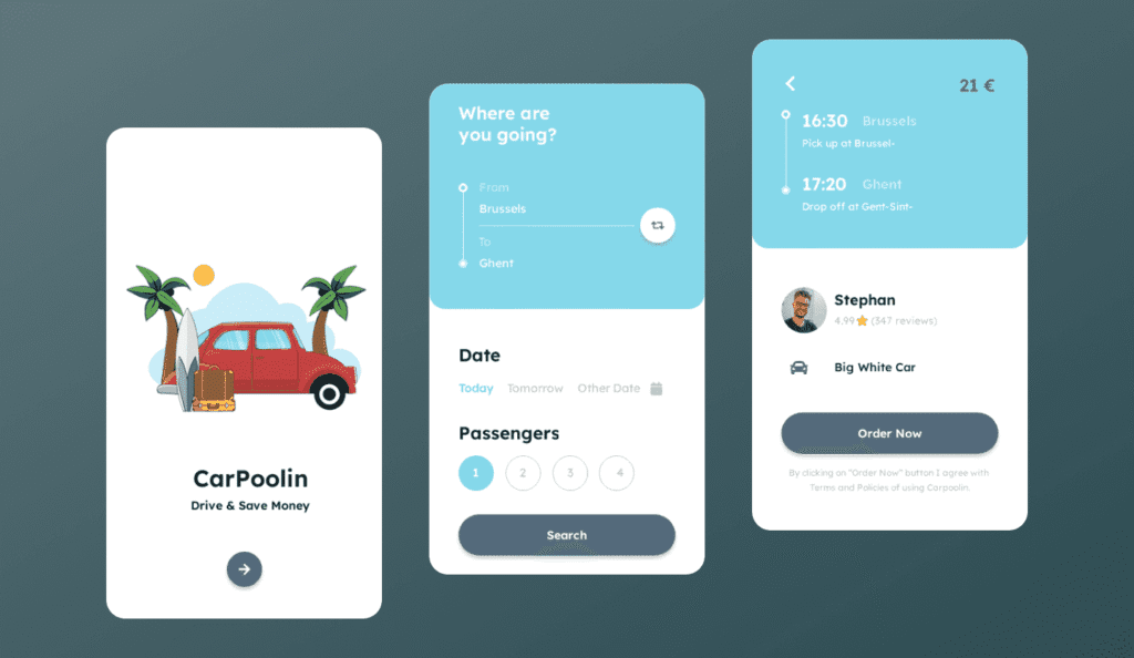
This comprehensive guide walks you through the complete mobile app interface design process, from initial research through final implementation. Whether you’re designing your first app or refining your tenth, you’ll discover actionable frameworks, practical techniques, and professional insights transforming concepts into polished, user-centered mobile experiences.
Let’s explore how strategic interface design creates apps users genuinely love.
Understanding Mobile App Interface Design Fundamentals
Before diving into specific steps, establishing clear understanding of what mobile app interface design actually encompasses and why it matters prevents common misconceptions derailing projects.
What Is Mobile App Interface Design?
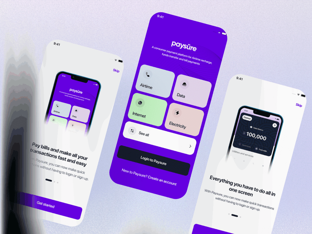
Mobile app interface design combines visual aesthetics with functional interaction patterns, creating the complete experience users have when engaging with mobile applications. It encompasses both UI (User Interface) and UX (User Experience) disciplines working together.
User Interface (UI) Design focuses on visual elements users see and interact with: colors, typography, buttons, icons, imagery, layouts, spacing, and overall aesthetic presentation. UI design makes apps visually appealing and on-brand.
User Experience (UX) Design addresses how apps function from user perspectives: navigation flows, information architecture, task completion efficiency, accessibility, and emotional satisfaction. UX design makes apps intuitive and effective.
Together, UI and UX create cohesive mobile experiences where beautiful aesthetics support functional excellence rather than conflicting with usability.
Why Mobile Interface Design Demands Specialized Approach
Mobile app interface design requires fundamentally different thinking than desktop or web design due to unique constraints and opportunities:
Screen Size Limitations: Mobile devices offer dramatically less screen real estate than desktops, demanding ruthless prioritization of essential elements and creative information architecture solutions.
Touch-Based Interaction: Unlike mouse-and-keyboard interfaces allowing precise pointing, touch interactions require larger targets, thumb-friendly positioning, and gesture-based patterns.
Variable Contexts: Users engage with mobile apps everywhere commuting, walking, in bright sunlight, with one hand while holding coffee requiring designs accommodating diverse usage scenarios.
Platform Conventions: iOS and Android have distinct design languages, interaction patterns, and user expectations that interfaces must respect for intuitive experiences.
Performance Constraints: Mobile devices have varying processing power, network speeds, and battery limitations affecting design decisions around animations, imagery, and functionality.
According to research, 88% of users are less likely to return after poor mobile experiences, while 58% develop more positive brand impressions when apps remember their preferences. These statistics underscore why specialized mobile interface design proves essential for app success.
Working with UX design experts who understand mobile-specific challenges ensures your app delivers experiences meeting elevated user expectations.
Essential Mobile Interface Design Principles
Before exploring step-by-step processes, understanding core principles guiding effective mobile interface design creates foundations for all subsequent decisions.
Simplicity and Clarity
Mobile interfaces demand radical simplicity. Screen space limitations mean every element must justify its presence. Remove anything not directly supporting user goals or core functionality.
Clear visual hierarchy guides attention naturally toward important elements. Use size, color, contrast, and positioning establishing obvious priorities so users immediately understand what matters most on each screen.
Consistency Throughout Experience
Consistent design patterns reduce cognitive load. When buttons, navigation, and interactions behave predictably across screens, users navigate confidently without relearning patterns constantly.
Maintain consistency in:
- Visual styling (colors, typography, spacing)
- Interaction patterns (tap behaviors, gestures)
- Component usage (buttons, cards, modals)
- Terminology and labeling
- Navigation structures
Touch-Friendly Interactions
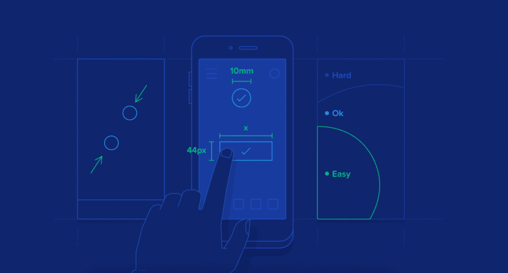
Design for fingers, not cursors. Minimum tap target sizes should be 44×44 pixels (iOS) or 48x48dp (Android), with adequate spacing preventing accidental taps.
Position frequently used controls within comfortable thumb reach, especially for one-handed use. The bottom third of screens represents the most accessible zone for thumb interaction.
Consider gesture-based navigation patterns swipes, long-presses, pull-to-refresh that feel natural on mobile devices while providing shortcuts for efficient interaction.
Accessibility for All Users
Accessible design benefits everyone, not just users with disabilities. Ensure sufficient color contrast (WCAG AA standards require 4.5:1 for normal text), support dynamic text sizing, provide alternative text for images, and maintain usability with screen readers.
Accessibility often improves general usability larger text helps everyone in bright sunlight, clear contrast aids users with aging eyes, and simple language benefits non-native speakers.
Platform-Appropriate Design
While maintaining brand consistency, respect platform conventions users expect. iOS users anticipate bottom tab bars and swipe gestures; Android users expect floating action buttons and navigation drawers.
Don’t force identical experiences across platforms embrace each ecosystem’s strengths while maintaining recognizable brand identity. Similar to how web design services adapt to different browsers, mobile interfaces should respect platform norms.
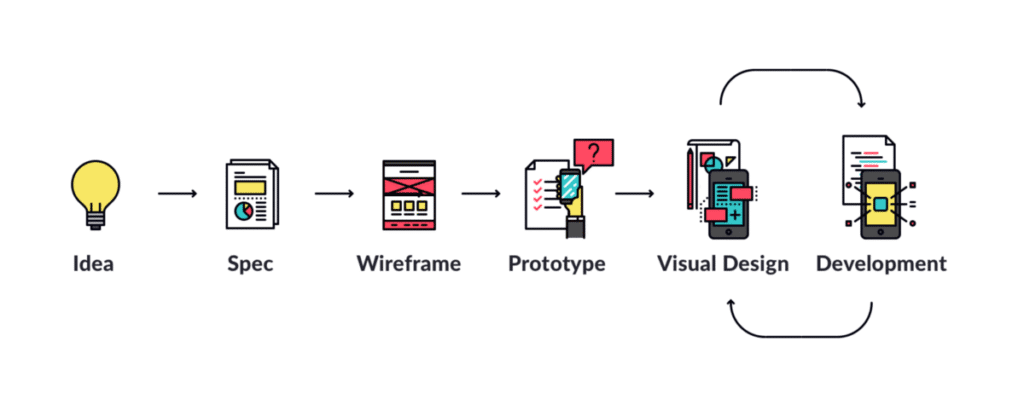
The Complete Mobile App Interface Design Process
Let’s walk through the systematic workflow professional designers follow creating exceptional mobile interfaces.
Step 1: Research and Strategic Foundation
Great interface design begins with understanding users, problems, context, and goals. Research prevents building beautiful solutions to wrong problems.
User Research Methods:
User Interviews: One-on-one conversations revealing motivations, frustrations, behaviors, and needs. Interview 5-8 users representing target segments to uncover patterns.
Competitive Analysis: Study similar apps identifying strengths to learn from and weaknesses to avoid. Note what users praise and criticize in reviews.
Analytics Review: If redesigning existing apps, examine usage data identifying popular features, abandonment points, and user flows.
Contextual Inquiry: Observe users in natural environments understanding how they actually interact with mobile devices in real-world situations.
Define Clear Objectives:
Document specific, measurable goals for your interface design:
- What problems does this app solve?
- Who are primary users and what do they need?
- What actions should users complete most frequently?
- How will success be measured?
Clear objectives provide direction throughout design, ensuring decisions serve strategic goals rather than just looking impressive.
Create User Personas:
Synthesize research into 2-4 personas representing distinct user types. Effective personas include demographics, goals, pain points, behaviors, technical comfort levels, and representative quotes.
Personas humanize abstract users, keeping teams focused on real people throughout design processes.
Step 2: Map User Journeys and Flows
Before designing screens, understand paths users take accomplishing goals within your app.
User Journey Mapping:
Visualize complete experiences users have from initial awareness through ongoing usage. Journey maps include:
- Stages users progress through
- Touchpoints with your app
- Actions taken at each stage
- Emotional states (frustration, confusion, delight)
- Pain points causing friction
- Opportunities for improvement
Journey maps reveal where design interventions create maximum impact.
Task Flow Diagrams:
For specific tasks (signup, checkout, content creation), create detailed flow diagrams showing:
- Entry points to the flow
- Sequential screens or steps
- Decision points requiring user choices
- Success and error states
- Alternative paths to completion
Clear task flows prevent designing screens in isolation, ensuring logical progressions toward goal completion.
Understanding user journeys before interface design parallels how web development planning precedes coding strategic structure enables effective execution.
Step 3: Create Low-Fidelity Wireframes
Wireframes establish structural foundations without visual design distractions. Focus on layout, hierarchy, and functionality.
Wireframing Approaches:
Paper Sketching: Fastest method for initial exploration. Sketch multiple screen variations quickly, experimenting with different layouts and navigation approaches.
Digital Wireframes: Use tools like Figma, Sketch, or Adobe XD creating simple grayscale layouts. Digital formats facilitate sharing with teams and stakeholders.
What to Define in Wireframes:
- Screen layouts and content organization
- Navigation patterns and menu structures
- Information hierarchy (what’s prominent vs secondary)
- Content types and placeholders
- Interactive element placement
- Relationships between screens
What to Avoid:
- Visual design details (colors, imagery, exact typography)
- Pixel-perfect precision (wireframes are explorations, not specifications)
- High-fidelity content (lorem ipsum works fine)
Wireframes enable rapid iteration and stakeholder feedback before investing time in detailed visual design.
Step 4: Develop Comprehensive Style Guide
Style guides establish visual language ensuring consistency across entire interface.
Color Palette Definition:
Select primary, secondary, and accent colors reflecting brand identity while ensuring accessibility. Limit to 3-5 main colors preventing visual chaos.
Define semantic colors for specific purposes:
- Success states (typically green)
- Error messages (typically red)
- Warnings (typically yellow/orange)
- Information (typically blue)
Test all color combinations ensuring sufficient contrast ratios meeting accessibility standards.
Typography System:
Choose 1-2 typefaces (maximum) for interface typically one for headings, one for body text. System fonts (San Francisco for iOS, Roboto for Android) often work excellently.
Define type scale with consistent sizing:
- Hero/display text: 32-40px
- Headings: 20-28px
- Subheadings: 16-18px
- Body text: 14-16px
- Captions/small text: 12-14px
Establish line heights, letter spacing, and font weights for each size ensuring readability across devices.
Iconography Standards:
Select icon style (filled, outlined, rounded, sharp) and maintain consistency. Icons should remain recognizable at small sizes (24x24px minimum).
Use standard conventions for common actions hamburger menus, search magnifying glasses, home houses so users recognize meanings instantly.
Spacing and Layout Systems:
Define base spacing unit (typically 4px or 8px) and use multiples for all margins, padding, and element sizing. Consistent spacing creates visual rhythm and polish.
Create grid systems (typically 12-column for flexibility) guiding content alignment across different screen sizes.
Style guides serve as single source of truth for visual decisions, ensuring consistency even when multiple designers work on projects. Similar to how creative web agency teams maintain brand guidelines, mobile interfaces need systematic visual standards.
Step 5: Design High-Fidelity Visual Mockups
Apply style guides to wireframes, creating polished, detailed screen designs representing final visual appearance.
Visual Design Process:
Start with Key Screens: Design most important or representative screens first (typically home, main feature, profile/settings). These establish visual direction for remaining screens.
Apply Visual Hierarchy: Use size, color, contrast, and spacing guiding attention toward priority elements. Primary CTAs should visually dominate their surroundings.
Add Real Content: Replace placeholders with actual copy and imagery. Realistic content reveals layout issues invisible with lorem ipsum.
Design All States: Don’t just show ideal scenarios. Design empty states (no content yet), loading states, error states, and success confirmations.
Consider Responsive Behavior: Show how designs adapt to different device sizes from small phones to large tablets and both portrait and landscape orientations.
Accessibility Checks:
- Verify color contrast ratios
- Ensure text remains readable at various sizes
- Confirm touch targets meet minimum dimensions
- Review with screen reader simulation
Design System Documentation:
As you create high-fidelity designs, document reusable components (buttons, cards, forms) in component libraries. This accelerates future design work and ensures consistency.
Step 6: Build Interactive Prototypes
Transform static mockups into clickable prototypes simulating actual app experiences.
Prototyping Tools:
- Figma: Industry-leading collaborative design with robust prototyping
- Adobe XD: Comprehensive prototyping with animation capabilities
- Principle: Animation-focused prototyping for complex interactions
- ProtoPie: Advanced prototyping supporting sensors and complex logic
What to Prototype:
Focus prototyping efforts on:
- Complex or novel interaction patterns requiring validation
- Critical user flows (onboarding, core features, checkout)
- Animations and transitions between states
- Gesture-based interactions
- Stakeholder presentations requiring realistic demonstrations
Interaction Design Elements:
Transitions: Define how screens connect through animations slides, fades, zooms that provide spatial context and continuity.
Micro-Interactions: Small interactive moments providing feedback button animations on press, checkbox checks, toggle switches that make interfaces feel responsive and alive.
Gestures: Implement common mobile gestures swipes for navigation, pull-to-refresh, long-press for context menus that leverage platform conventions.
Loading States: Show how interfaces behave during data fetches, providing progress indicators maintaining user confidence during waits.
Prototypes reveal usability issues invisible in static designs while facilitating stakeholder communication and user testing.
Understanding custom conversion principles helps optimize prototypes for desired user actions and business outcomes.
Step 7: Conduct Rigorous Usability Testing
Testing validates design decisions against real user behavior, revealing what works and what needs refinement.
Testing Methods:
Moderated Usability Testing: Observe 5-8 users completing specific tasks using your prototype. Ask them to think aloud, verbalizing thoughts and decisions.
Unmoderated Testing: Use platforms like UserTesting allowing participants to complete tasks independently while screen recording captures behaviors and audio captures commentary.
A/B Testing: Compare design variations determining which performs better for specific metrics (completion rates, time-on-task, error rates).
First-Click Testing: Evaluate where users first tap attempting tasks, revealing whether navigation and layout match mental models.
What to Test:
- Can users complete core tasks successfully?
- Where do users hesitate or show confusion?
- Do users understand navigation and information architecture?
- Are interactive elements obvious and accessible?
- What emotional responses do users exhibit?
Analysis Approach:
- Identify patterns across multiple users (individual issues might be unique; patterns indicate systemic problems)
- Prioritize issues by severity (prevents completion vs causes minor frustration) and frequency (affects most vs few users)
- Distinguish usability problems from subjective preferences
- Document specific observations with video clips and quotes
Testing prevents launching apps users struggle with, ensuring interfaces actually solve problems they’re designed to address.
Step 8: Iterate and Refine Based on Feedback
Based on testing insights, make targeted improvements addressing identified issues.
Iteration Best Practices:
Address Critical Issues First: Fix problems preventing task completion before cosmetic refinements.
Make Focused Changes: Rather than wholesale redesigns, implement specific improvements addressing identified problems. Targeted changes are easier to validate.
Retest Changes: After implementing fixes, conduct quick validation tests (3-5 users) confirming improvements work without creating new issues.
Document Decisions: Maintain design rationale explaining why specific choices were made. This helps teams understand thinking behind designs and prevents rehashing settled decisions.
Prepare for Development Handoff:
Design Specifications: Create detailed documentation showing measurements, spacing, colors, typography, and interaction behavior guiding developers.
Asset Export: Provide graphics, icons, and images in required formats and resolutions for various devices (1x, 2x, 3x for iOS; mdpi, hdpi, xhdpi, xxhdpi, xxxhdpi for Android).
Component Libraries: Organize reusable components developers can reference ensuring consistent implementation.
Developer Collaboration: Maintain ongoing communication during development ensuring designs are implemented faithfully while accommodating technical constraints.
Similar to how website development company teams bridge design and development, mobile interface designers must facilitate smooth handoffs.
Step 9: Design Platform-Specific Versions
While maintaining brand consistency, create platform-appropriate versions for iOS and Android.
iOS Design Considerations:
- Use bottom tab bars for primary navigation
- Implement swipe gestures for back navigation
- Apply San Francisco system font
- Use subtle shadows and depth sparingly
- Follow Apple’s Human Interface Guidelines for component usage
Android Design Considerations:
- Implement floating action buttons for primary actions
- Use navigation drawers or bottom navigation
- Apply Roboto system font
- Embrace Material Design elevation and shadows
- Follow Material Design guidelines for components and patterns
Maintain Brand Identity Across Platforms:
While respecting platform conventions, maintain recognizable brand elements:
- Consistent color palettes
- Brand-specific iconography
- Unique illustration styles
- Distinctive visual treatments
The goal is creating experiences feeling native to each platform while maintaining clear brand identity.
Step 10: Plan for Ongoing Optimization
Mobile interface design doesn’t end at launch ongoing optimization ensures apps remain effective as user needs evolve.
Post-Launch Activities:
Analytics Monitoring: Track actual user behavior identifying friction points, popular features, and abandonment stages.
User Feedback Collection: Gather ongoing input through in-app surveys, app store reviews, support tickets, and feature requests.
Performance Metrics Tracking: Monitor success metrics defined in Step 1, evaluating whether designs achieve intended business outcomes.
Continuous Improvement Cycles: Regular review and refinement sessions keep interfaces aligned with evolving user expectations, competitive landscape, and business goals.
A/B Testing Optimizations: Test design variations on live products determining which changes improve key metrics before rolling out to all users.
Treating mobile interfaces as living products requiring continuous attention ensures long-term success rather than gradual decline.
Essential Mobile Interface Design Tools
Professional designers rely on various specialized tools throughout design processes:

Design and Prototyping
- Figma: Collaborative design and prototyping with powerful component systems
- Sketch: Mac-focused interface design with extensive plugin ecosystem
- Adobe XD: Comprehensive design, prototyping, and collaboration platform
- Framer: Code-based prototyping for complex interactions
User Testing and Research
- UserTesting: Remote usability testing with participant recruitment
- Maze: Product research platform with various testing methodologies
- Hotjar: Behavior analytics, heatmaps, and session recordings
- Lookback: Live user interviews and testing sessions
Collaboration and Handoff
- Zeplin: Design-to-development handoff with automatic specifications
- InVision: Design collaboration and stakeholder presentations
- Abstract: Version control for design files
- Miro: Virtual whiteboarding for workshops and ideation
Accessibility Testing
- Stark: Accessibility checker integrated with design tools
- Color Oracle: Color blindness simulator
- Contrast: Quick contrast ratio checking
These tools support workflows but don’t replace strategic thinking, user empathy, and design expertise the true foundations of exceptional interfaces.
Mobile Interface Design Best Practices
Beyond systematic processes, certain practices consistently produce superior mobile interfaces:

Prioritize Essential Content
Mobile screen limitations demand ruthless prioritization. Include only information and features users actually need for completing tasks. Everything else is distraction.
Use progressive disclosure revealing complexity gradually as users demonstrate interest rather than overwhelming immediately.
Design for One-Handed Use
49% of users interact with phones using just one thumb. Position frequently used controls within comfortable thumb reach (bottom two-thirds of screens) rather than stretching to top corners.
Minimize Input Requirements
Typing on mobile devices is tedious. Reduce required text entry through:
- Smart defaults based on context
- Autofill and autocomplete
- Selections and toggles instead of typing
- Voice input options
- Stored preferences
Provide Immediate Feedback
Users should never wonder whether taps registered or what’s happening. Provide instant visual feedback for all interactions through button animations, loading indicators, progress bars, and success confirmations.
Optimize for Various Lighting Conditions
Users access apps outdoors in bright sunlight and indoors in dim lighting. Ensure sufficient contrast making interfaces readable in diverse conditions. Consider offering dark mode alternatives.
Test on Real Devices
Prototypes and emulators provide previews, but nothing replaces testing on actual phones and tablets. Physical devices reveal issues with touch target sizes, readability, and performance invisible on desktop screens.
Working with professional website design experts who understand both web and mobile ensures cohesive experiences across platforms.
Common Mobile Interface Design Mistakes
Even experienced designers sometimes fall into these traps:

Ignoring Platform Guidelines
Forcing identical experiences across iOS and Android frustrates users expecting platform-specific patterns. Respect conventions while maintaining brand identity.
Cluttering Screens
Cramming too much information onto small screens overwhelms users. Embrace white space and simplicity, breaking complex tasks across multiple focused screens.
Tiny Touch Targets
Small buttons and links frustrate users and cause errors. Always use minimum dimensions (44x44px or 48x48dp) with adequate spacing.
Inconsistent Patterns
Changing navigation, button styles, or interaction patterns across screens confuses users. Maintain consistency throughout experiences.
Neglecting Empty and Error States
Designing only ideal scenarios leaves users confused when content is missing or actions fail. Design for all states including empty, loading, and error conditions.
Poor Contrast and Readability
Low-contrast text strains eyes and fails accessibility requirements. Ensure readable contrast ratios and support dynamic text sizing.
Overusing Animations
While animations enhance usability, excessive motion becomes distracting and impacts performance. Use animations purposefully for feedback and spatial orientation.
Frequently Asked Questions
How long does mobile app interface design take?
Mobile interface design timelines vary dramatically based on complexity and scope. Simple apps with 5-10 screens might require 2-4 weeks for complete interface design including research, wireframes, visual design, and prototyping. Medium-complexity apps with 15-30 screens typically need 6-10 weeks. Complex apps with extensive features, multiple user types, or intricate flows often require 3-4 months or more.
Factors affecting timelines include research depth, stakeholder availability, iteration cycles, testing requirements, and whether you’re designing for one or both platforms (iOS and Android). Rushing compromises quality while thorough processes produce better outcomes. Work with web design and development agency teams who balance efficiency with excellence.
Should I design for iOS or Android first?
The decision depends on your target audience and business priorities. If your users are primarily in North America or other Apple-dominant markets, start with iOS. If targeting global audiences or price-sensitive segments, begin with Android which dominates worldwide market share.
Many designers follow a “design for one, adapt for the other” approach designing thoroughly for one platform then adapting to the second while respecting its conventions. Alternatively, some use platform-agnostic initial design phases (research, user flows, wireframes) before creating platform-specific visual designs and prototypes. Neither approach is universally better choose based on your specific user base, market strategy, and available resources.
What’s the difference between mobile UI and UX design?
UI (User Interface) design focuses on visual aesthetics and presentation colors, typography, buttons, icons, layouts, and overall visual styling that makes interfaces attractive and on-brand. UX (User Experience) design addresses how interfaces function from user perspectives navigation flows, information architecture, task efficiency, accessibility, and emotional satisfaction throughout interactions.
UI determines how interfaces look; UX determines how they work and feel. Both are essential and deeply interconnected: beautiful UI with poor UX creates frustrating experiences, while excellent UX with ugly UI undermines credibility. The best mobile interfaces excel at both, combining aesthetic appeal with functional excellence. Modern mobile designers often possess skills spanning both disciplines, though specialists focusing primarily on one area also exist in larger teams.
How much does professional mobile interface design cost?
Mobile interface design costs vary widely based on complexity, designer experience, and project scope. Freelance designers typically charge $50-$150 per hour, with complete app interface designs ranging $5,000-$25,000 depending on complexity.
Design agencies charge $75-$200+ per hour or $15,000-$100,000+ for comprehensive projects including research, multiple platforms, testing, and extensive iteration. Simple apps with standard features cost $5,000-$15,000. Medium-complexity apps with custom features and interactions run $15,000-$40,000. Complex apps with advanced functionality, multiple user types, or intricate flows cost $40,000-$100,000+.
Investment depends on required quality, business goals, competitive positioning, and whether you need both iOS and Android versions. Consider ROI rather than just absolute cost excellent interface design dramatically impacts user retention, engagement, and revenue.
Can I design mobile interfaces without coding skills?
Absolutely modern design tools like Figma, Sketch, and Adobe XD enable creating complete interface designs and interactive prototypes without writing code. These platforms use visual interfaces and simple linking for creating clickable prototypes demonstrating app functionality.
However, understanding basic technical concepts helps create realistic, implementable designs. Learn platform capabilities, common technical constraints, and development feasibility considerations so designs don’t require impossible implementations. Collaborate closely with developers throughout processes ensuring designs are technically feasible while maintaining creative vision.
Many successful interface designers never write production code but understand enough about development to create designs developers can actually build. The key is focusing on your strengths while partnering with complementary skills designers design, developers develop, and collaboration produces excellent results.
Transform Your App Concept Into Beautiful Reality
Creating exceptional mobile app interface design requires balancing aesthetic appeal with functional excellence, platform conventions with brand identity, and user needs with business objectives. While the process involves numerous steps and considerations, following systematic approaches ensures you create interfaces users genuinely enjoy rather than merely tolerate.
Remember that great interface design is iterative your first version won’t be perfect, and that’s expected. Each round of user feedback and testing brings you closer to experiences truly serving your audience while achieving your business goals.
The most successful mobile apps treat interface design not as one-time effort but as ongoing commitment to excellence. They continuously gather user feedback, monitor analytics, test improvements, and refine experiences keeping apps competitive in rapidly evolving markets.
Let’s Build Your Exceptional Mobile App Interface
At Web Guider Agency, we specialize in creating mobile app interfaces combining stunning aesthetics with intuitive usability across iOS and Android platforms. Our web design studio approach applies proven methodologies while adapting to each project’s unique requirements and goals.
From initial research through final implementation and beyond, we partner with clients building mobile experiences users love and that drive measurable business results. Our comprehensive process ensures your investment delivers returns through improved engagement, higher retention, and sustainable growth.
Book a free consultation to discuss your mobile app vision and discover how our interface design expertise can bring your concept to life. Whether you’re starting fresh or redesigning an existing app, we’ll guide you toward success.
View our projects to see mobile and web interfaces we’ve created for clients across industries. Explore our services to understand our comprehensive approach to digital design excellence.
Ready to create something exceptional? Start your project today and let’s build mobile interfaces users genuinely love.
About Web Guider Agency: Web Guider Agency is your trusted partner for mobile app interface design, user experience optimization, and digital strategy. With extensive expertise creating intuitive, conversion-focused designs across platforms, we help businesses build digital products users love that drive measurable results. Learn more about us and our commitment to design excellence delivering real business value. Contact us today to transform your vision into exceptional mobile reality.
Author
-

I'm Marufur Rahman Abir, Founder, Marketer & Lead Designer of Web Guider. I help businesses create beautiful and user-friendly digital experiences that actually work for real people. My passion lies in UX/UI design—where aesthetics meet functionality. I believe great design isn't just about looking good; it's about solving real problems and making people's lives easier. Through this blog, I share practical insights, design tips, and lessons I've learned from working with clients across various industries.

